Brief
Background
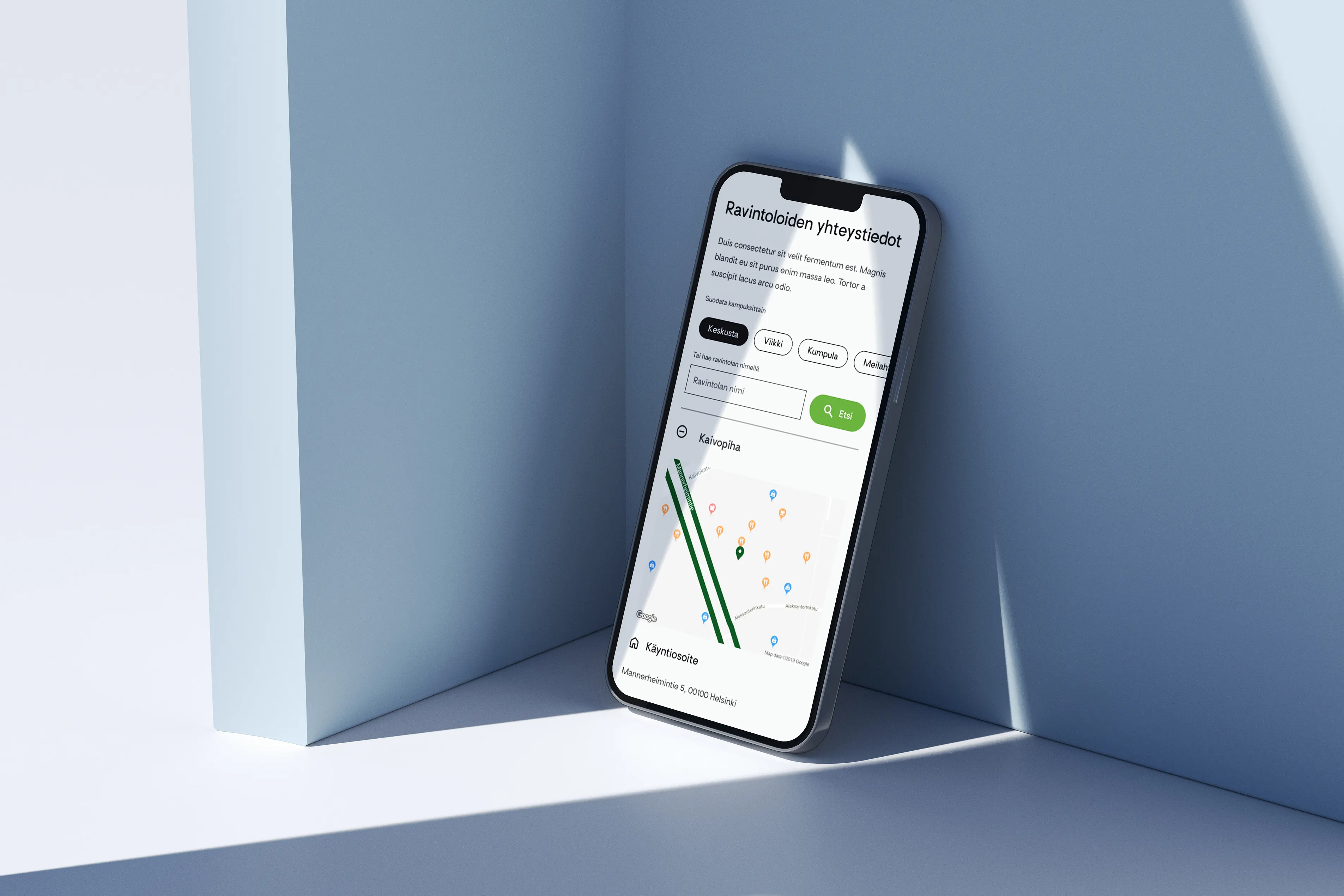
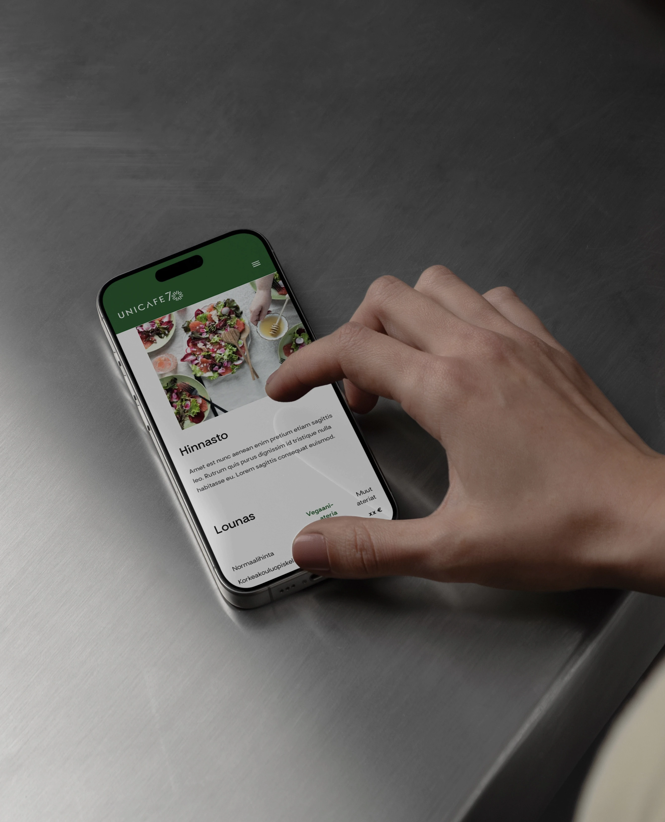
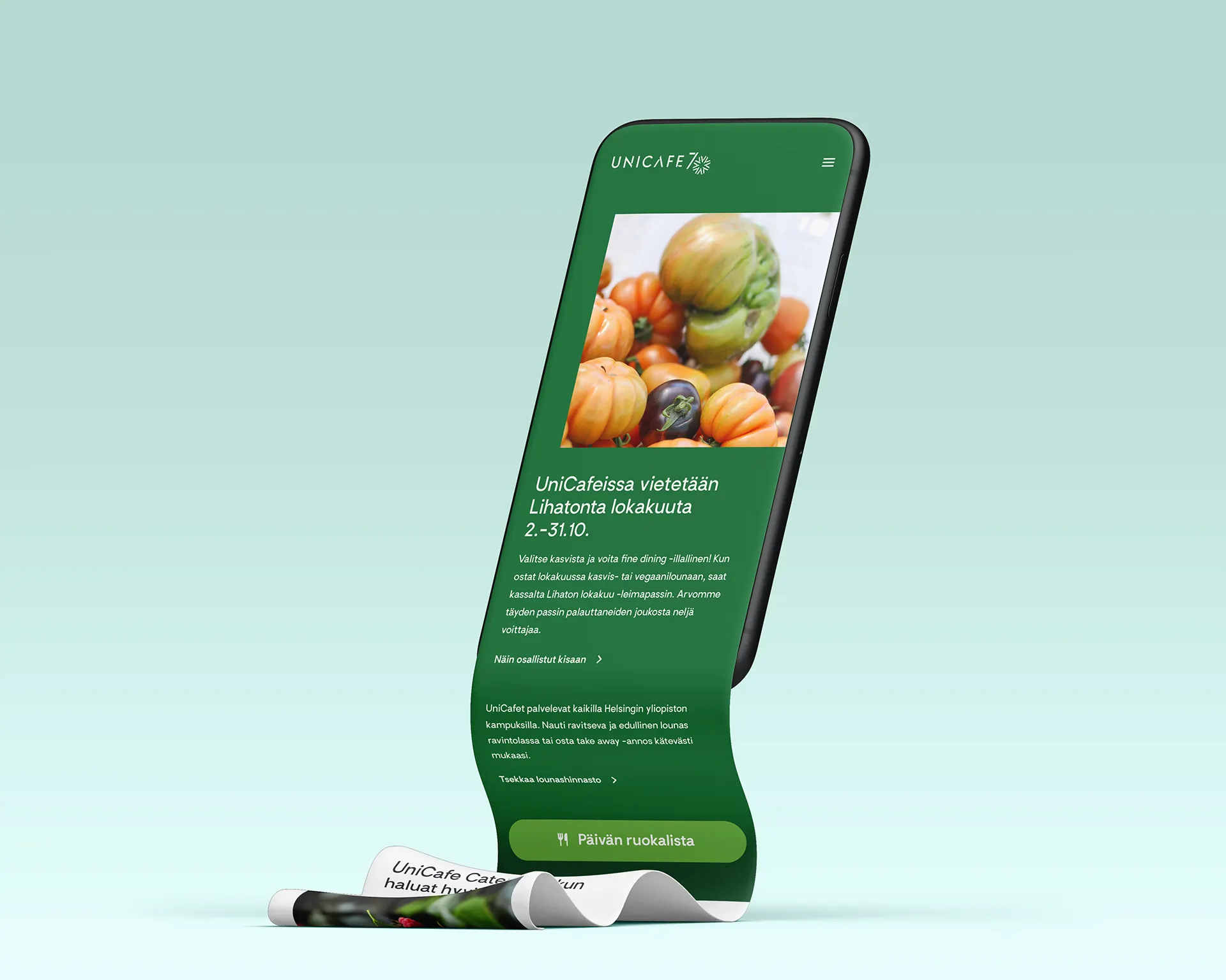
UniCafe's rebranding in 2020 came with several newsworthy changes to their services and improvements to both online and offline services. As part of the project, they renewed their homepage, enhancing the way in which information about the menus in their multiple restaurants were displayed. The new system incorporated colour coding to indicate meal types and price ranges, iconography for allergies and dietary restrictions, and other improvements.
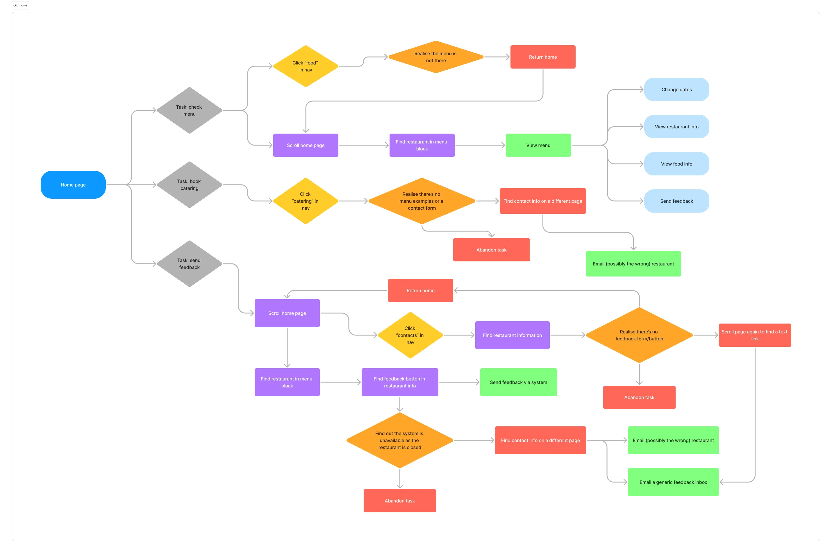
However, customer feedback indicated the menu was in fact extremely cumbersome to view. Especially mobile users found it difficult as large card elements took a lot of space on the screen, requiring users scroll back and forth on the page to see menu items and change restaurants.
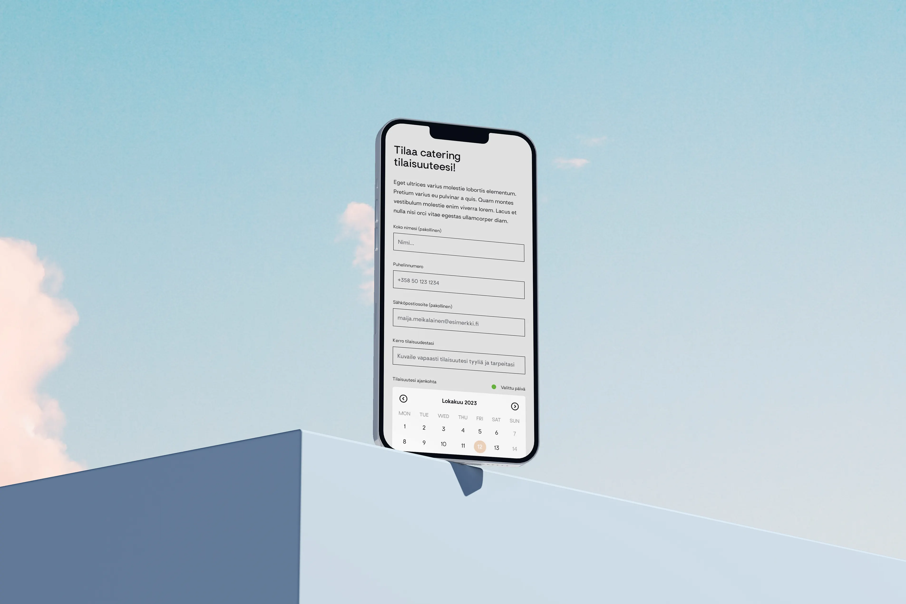
As a result, UniCafe released a browser-based web app focusing only on displaying menus. The new service was well received for its clear UI and well-thought UX; as well as future scalability. However, this created a rift between UniCafe's online services: who were the different sites really for?
Business impact
Higher engagement rates would be more likely to lead to conversions. Redefining the target audience would greatly impact user retention as well. On a whole, it would also make it easier to allocate resources to website management, and make it easier to use the website in designated marketing campaigns.
Project goal
Understanding the users' pain points caused by overlapping services, creating a prototype with improved navigation and content hierarchy